How many users could complete the full verification without having to try again?
78%succeeded on
their first attempt
their first attempt
CASE STUDY
THE PROJECT
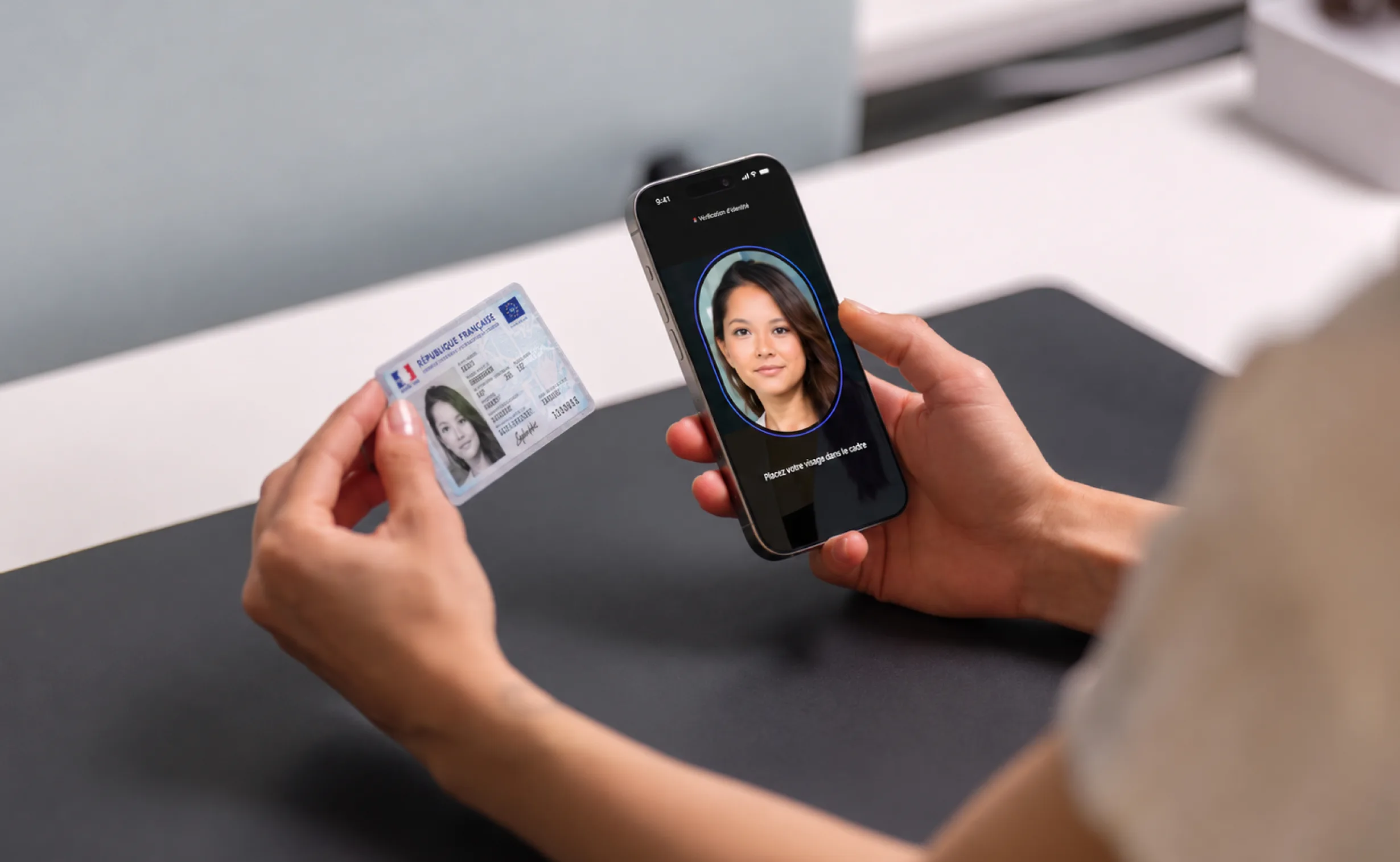
AR24, a Docaposte company, provides remote identity verification services for situations where a high level of confidence in a person’s identity is required.
In 2021, ANSSI, the French national cybersecurity agency, introduced the PVID framework (Prestataire de Vérification d’Identité à Distance). It defines a stricter set of security and verification requirements for organisations verifying identities remotely, particularly for sensitive digital services where proving who is behind the screen is critical.
Meeting this higher level of assurance introduced a more demanding journey for users, with additional capture and verification steps that had to remain both understandable and correctly executed.
When we joined the project in 2022, a first version was already live. Some steps were generating higher failure rates than AR24 wanted, so our team was brought in to audit the existing flow, identify where and why users were struggling, and redesign the experience without weakening the required level of verification.
I worked closely with a UX Designer on the audit, research and UX design. I took more direct ownership of the UI, interaction design, high-fidelity prototyping and Design-to-Dev delivery.
THE CHALLENGE
How many users could complete the full verification without having to try again?
01Diagnosis
Before proposing a new version, we wanted to understand the existing experience from every angle rather than redesign it from assumptions.
We started with a detailed audit of the live journey, reviewing the flow screen by screen and identifying what worked, what created friction and where the experience could be improved. We then presented that diagnosis back to the Product team to establish a shared understanding of the problems before moving into design.
We complemented the audit with user testing on the existing product. Watching people go through the real journey allowed us to observe hesitation, instructions they overlooked, actions they misunderstood and the moments where the experience became difficult or stressful.
In parallel, we benchmarked other remote identity verification experiences, including providers that were also adapting their products to the new PVID framework. This helped us understand how an emerging market was approaching similar security and usability constraints.
Combining the expert audit, user behaviour, direct feedback and benchmark gave us the foundation we needed before starting the redesign.
02Constraints
Our research confirmed that the experience needed to become clearer and easier to complete. But unlike many digital journeys, simplification could not simply mean removing the steps users found difficult.
The level of assurance required by the PVID framework imposed a sequence of identity-document and face-verification actions. Those constraints were part of the service itself and could not be removed.
There was another constraint: once users submitted their verification, it had to be reviewed by a human operator as part of the PVID process. This meant users could complete the entire journey without knowing whether every action had been performed correctly. The result could arrive minutes or hours later, and if one or more actions had failed, the verification could be rejected and the user might have to start again. For security reasons, they could not necessarily be told exactly which step had caused the failure.
Two design challenges became central: make the journey easier to anticipate, and help users perform each required action correctly the first time.
03Guidance
The existing experience felt like a long succession of individual actions. Rather than trying to hide that complexity, we worked on making the journey easier to understand before and while users moved through it.
Structure the journey
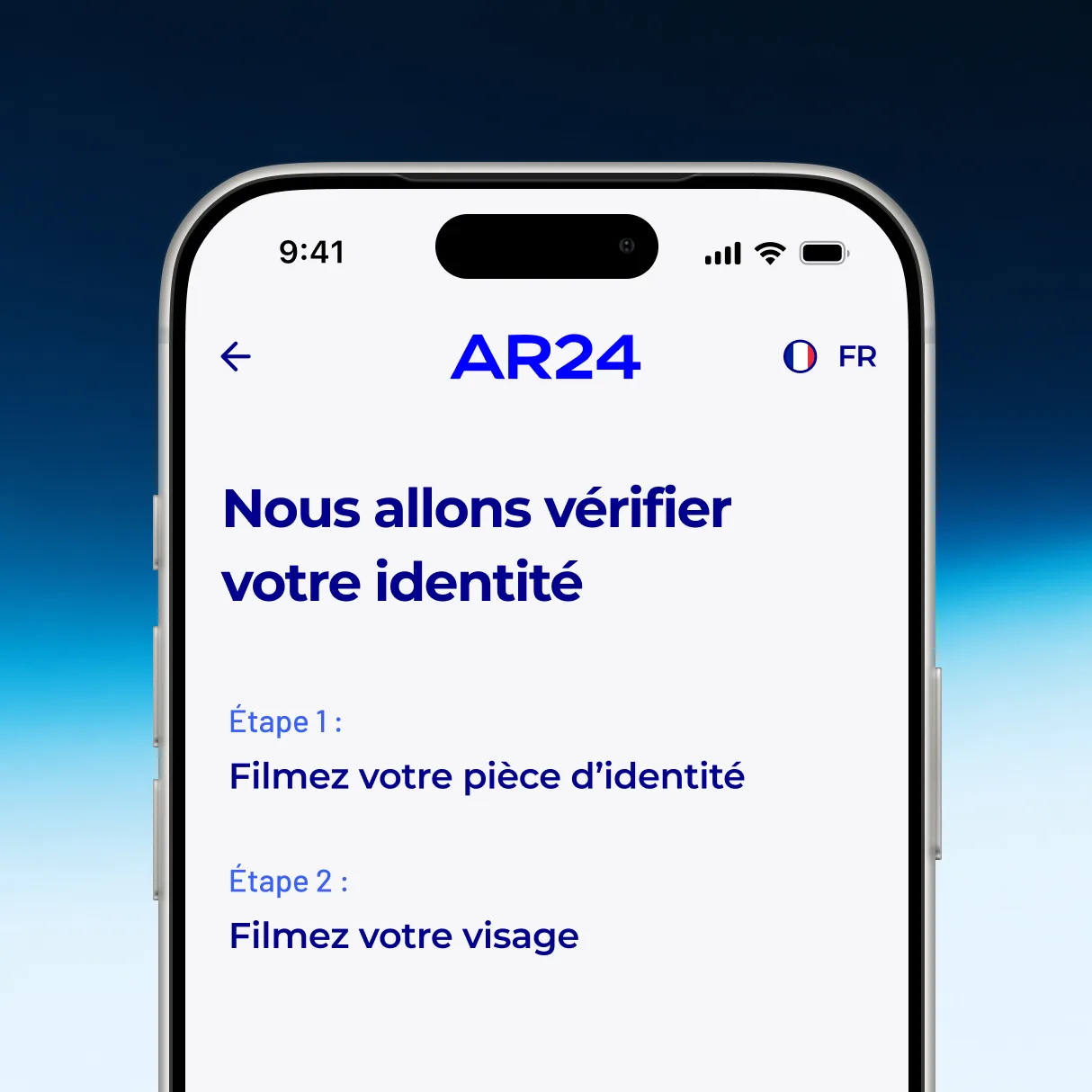
Instead of presenting the flow as a long sequence of individual steps, we organised it around two clear phases: Identity document and Face Capture.
This gave users a simpler mental model of the journey and made it easier to understand what they had already completed and what was still ahead.
Because some mistakes could only be discovered after submission, error recovery was not possible inside the journey. We therefore focused on preparing and guiding users before and during each action, so they had a better chance of performing it correctly the first time.
Understand
Early versions relied heavily on written instructions, which were not always effective for explaining unfamiliar physical actions. We simplified the copy and paired it with animated illustrations showing the expected movement directly, making the gesture easier to understand before recording started.
04Realistic testing
Some of the most important usability problems happened while users were physically interacting with the camera.
A standard click-through prototype would have forced participants to imagine those moments instead of actually performing them, making the test less representative of the real experience.
I proposed using ProtoPie and built a high-fidelity prototype with a working camera, allowing participants to actually record themselves and perform the required gestures during testing.
We then tracked success and failure step by step and combined those results with observation to understand not only where users struggled, but why.
05Iteration
One step stood out with the highest failure rate in our tests: more than 20% of users failed when they had to record themselves turning their head in the requested direction.
The instruction seemed simple on paper, but in practice many users turned the wrong way. The issue became even more noticeable when people were filming themselves, as the mirrored camera view made left and right easier to confuse.
First iteration: make the direction clearer.
Initially, the interface explicitly asked users to turn their head to the right or left. Testing showed that many participants still confused the two directions, so simply making the instruction more visible was not enough.
Second iteration: show the movement instead of describing it.
We removed the notion of left and right altogether and replaced it with a large animated arrow showing the direction to follow, alongside a face illustration performing the expected movement.
The interaction changed from asking users to interpret a direction to letting them mirror a demonstrated movement. The following tests showed a further improvement.
06Adapting the research
Some interactions still showed meaningful failure rates, but in a standard session with a small group of participants that could represent only one or two failed attempts.
That was enough to identify a potential problem, but not always enough to understand its cause.
I therefore adapted the research approach and ran targeted guerrilla tests around specific gestures, focusing each session on the interactions we still needed to understand better.
We also met AR24 operators in Strasbourg. Because they reviewed failed submissions every day, they had visibility over recurring execution errors that were much harder for us to encounter repeatedly during occasional usability sessions.
Instead of relying on one research method, I adapted the method depending on what we still needed to understand.
07Delivery and live product
Once an iteration was ready, my involvement continued through implementation. I prepared the screens, states and interaction specifications, worked directly with the developer, and ran Design and functional QA across multiple devices.
Once live, the product became a new source of evidence. We used Hotjar to identify remaining friction and continued iterating based on real user behaviour.
08Reflection
I would keep the same overall approach, but I would introduce success and failure tracking earlier in the process.
We began using that data after several iterations. Having it from the start would have helped us identify the interactions needing attention more quickly and decide where qualitative investigation was most useful.
This project also changed how I think about interaction design. On a highly guided journey, a countdown, a movement or a feedback state is not simply polish. It can directly affect whether an action is understood and performed correctly.