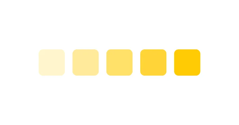
Primitive
Raw values
The underlying palette of values, with no opinion about where they are used.
CASE STUDY
THE PROJECT
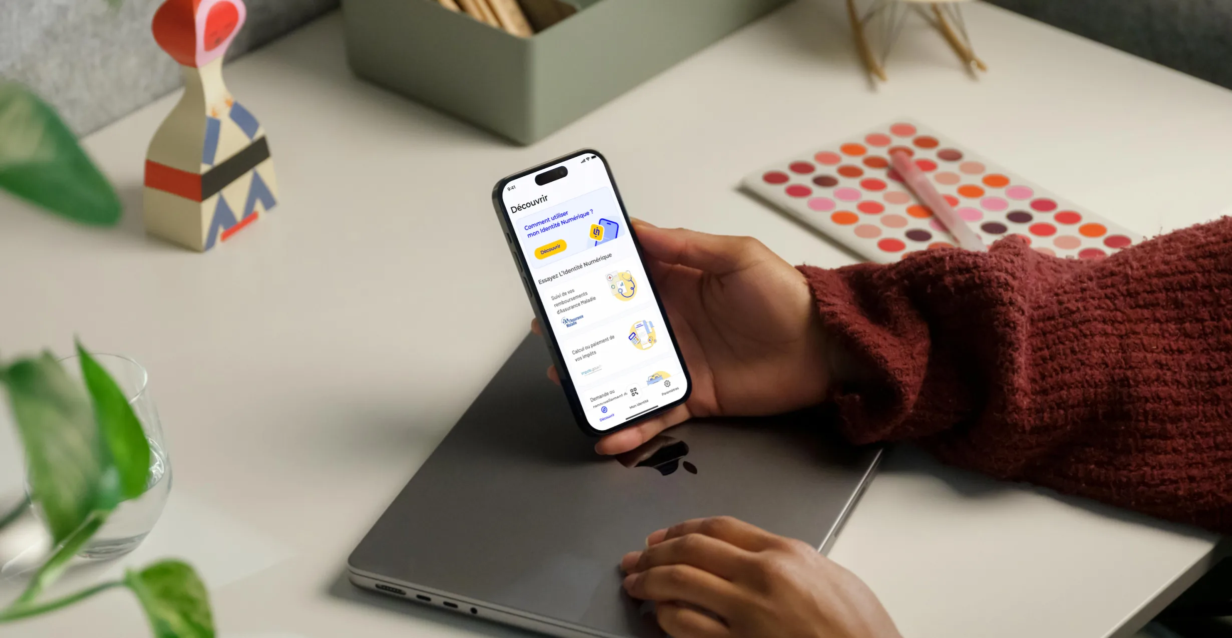
La Poste Digital Identity is a secure digital identity service that allows people to prove who they are and authenticate to online services without repeatedly creating new accounts or sharing identity documents.
Through FranceConnect and FranceConnect+, it can be used for everyday and more sensitive online services (taxes, CAF, France Travail, Mon Compte Formation) while providing stronger protection against identity fraud. Today, La Poste Digital Identity has been adopted by 9 million people and provides access to more than 1,800 services.
When I joined the project, the product was already live and scaling quickly. At the same time, different parts of the experience were evolving in parallel across several Product squads.
I joined the project as one of two UI Designers in a Design team that also included four UX Designers and one Project Manager. We worked alongside four Product Managers and the development teams. While the UX Designers were embedded in different product areas, the two UI Designers worked horizontally across the experience.
Our challenge was not simply to design individual interfaces, but to preserve a coherent level of UI quality as the product, the system and the number of contributors grew.
THE CHALLENGE
01UI consistency
As one of the two UI Designers, I worked horizontally across the entire experience, while the UX Designers were embedded in separate squads, each focused on a specific part of the product with their Product Manager.
Depending on the topic, I could join once the UX was already defined or earlier in the process to challenge and refine the solution with the UX Designer before moving into UI.
Moving constantly between journeys gave us visibility across the product, but also exposed a recurring risk: as squads solved their own problems independently, local decisions could progressively fragment the overall experience.
Our role therefore extended beyond designing screens. We were also responsible for maintaining UI consistency, evolving the Design System and following quality through delivery and implementation.
02Design System
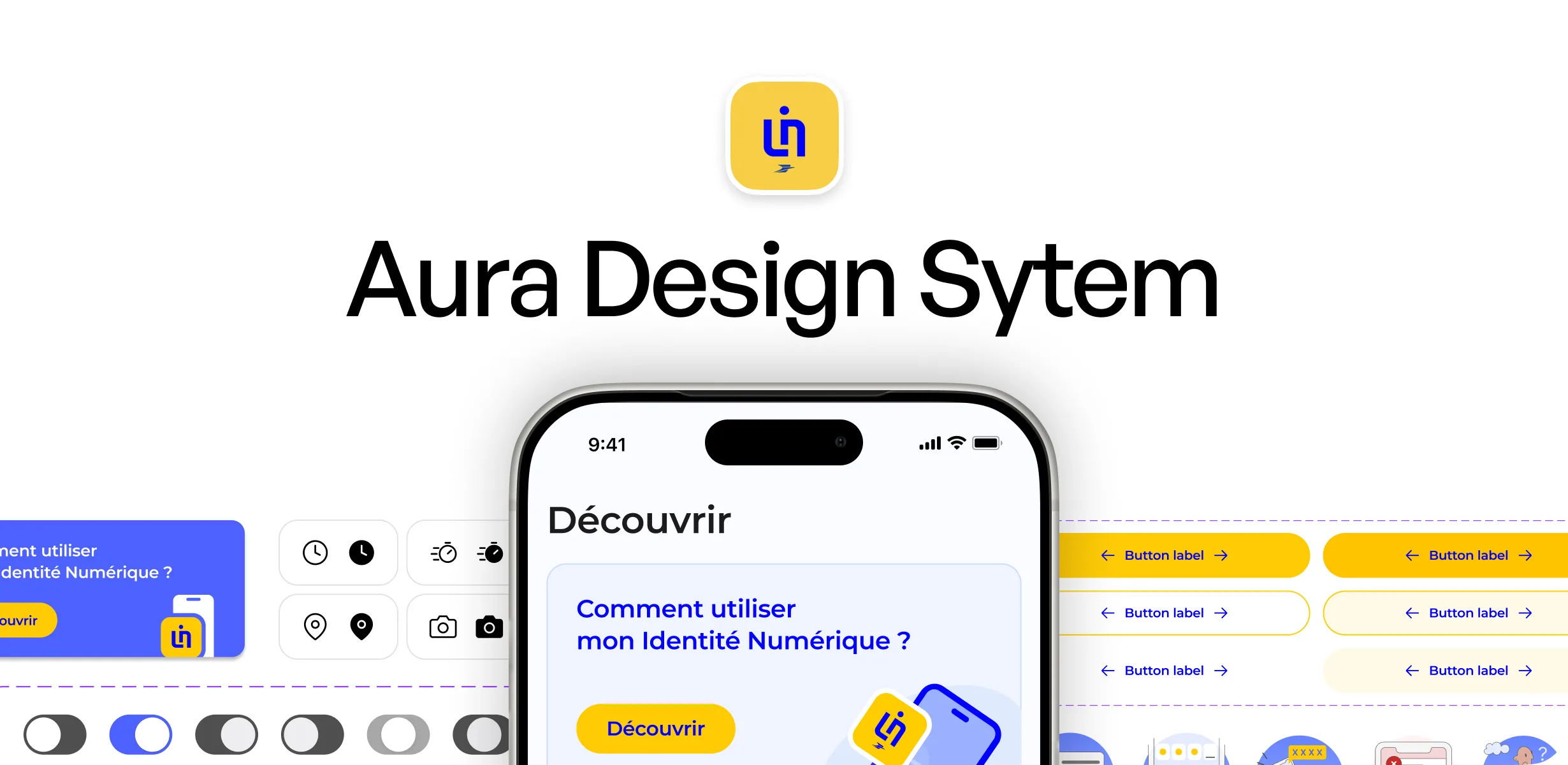
The Design System already existed when I joined. Together with the other UI Designer, I was responsible for maintaining and evolving it as new needs emerged from the different squads.
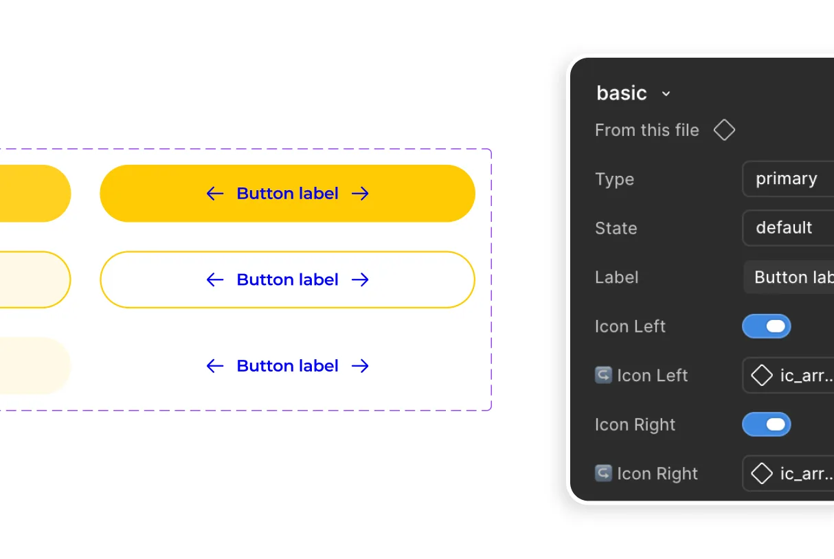
As the product grew and new needs emerged across the different squads, the existing system became harder to extend consistently. Together with the other UI Designer, we decided to evolve it into a V2: revisiting existing components, improving how they were built in Figma, creating the missing patterns and cleaning up a library that had grown alongside the product.
We reviewed existing components, improved their construction in Figma, created missing components and cleaned up inconsistencies that had accumulated as the product evolved.
Component changes were tested in real product screens before being integrated into the system. When needed, we involved other designers and developers to ensure that the rules worked both in the interface and in implementation.
The work also extended beyond components to the broader asset library. We cleaned up and structured shared visual assets including illustrations, logos and iconography, reorganising icons into line, plain and contextual families and improving their organisation and naming.
03Figma Variables
The existing Design System still relied mainly on Figma Styles, with some values maintained manually across the three mobile sizes we used. A change could therefore require several updates and create inconsistencies between variants.
When Figma introduced Variables, I proposed using the opportunity to rethink the architecture rather than simply migrating our existing Styles into a new feature.
I first audited the existing setup, then structured the tokens across three levels: primitive → semantic → component.
Raw values were separated from their intended meaning, then from component-specific decisions. We progressively remapped components onto this architecture, allowing more rules to be centralised and propagated consistently across the system.
The objective was not to make responsive behaviour automatic. It was to make the system easier to evolve systematically and less dependent on local manual fixes.
Token architecture
Raw values
The underlying palette of values, with no opinion about where they are used.
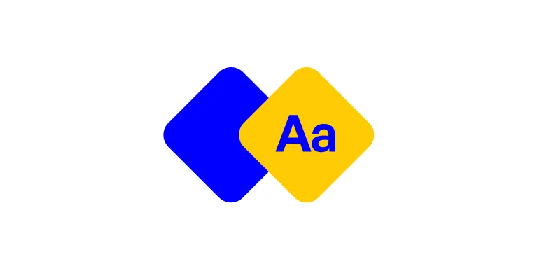
Meaning / intended use
What a value is for in the product, so intent is decided once and reused.

Component-specific decisions
The choices that belong to a single component, kept out of the shared layers.
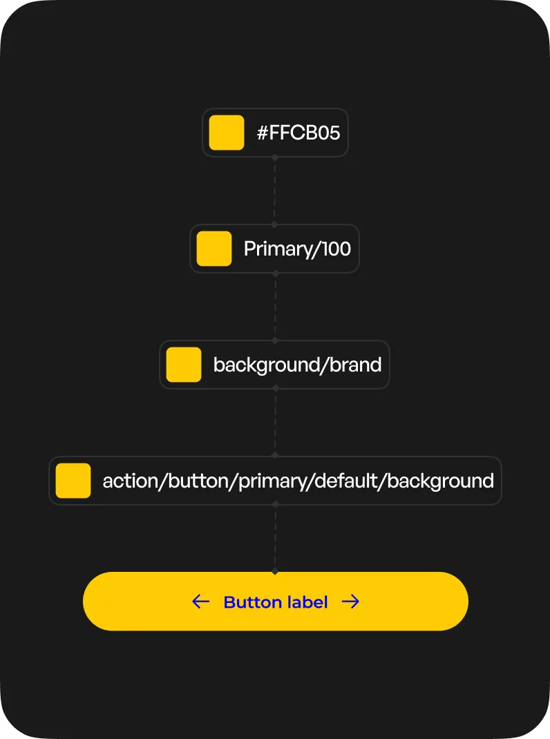
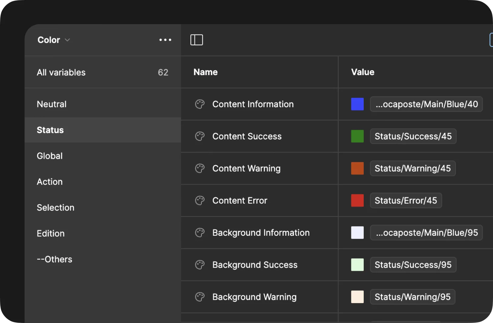
Change one underlying rule: multiple contexts update coherently
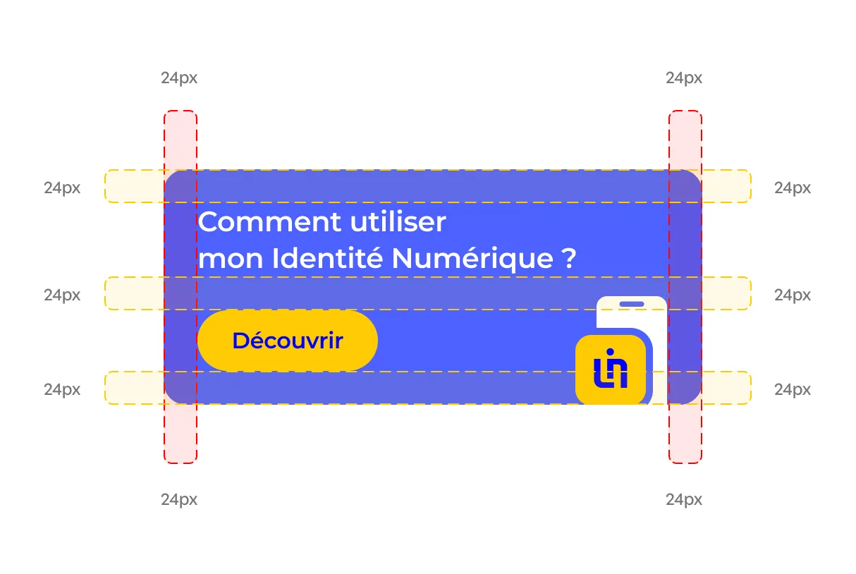
I standardised spacing and radius values to improve visual consistency across components. I then used Variables to streamline screen variations across our three sizes, Lg, Md and Sm, by centralising the values that changed between them. This reduced repetitive manual adjustments and the risk of inconsistencies across large batches of screens. I also structured a Light/Dark theme mode, anticipating a potential dark mode without duplicating the system.
Live demo
Updating the Figma library was not enough if the rules behind it remained implicit.
I was responsible for the Design System documentation in ZeroHeight, which served as a reference for developers and other teams working on La Poste Digital Identity.
After the V2, I reviewed the documentation as a whole. I benchmarked other mature Design Systems, reorganised parts of the structure and documented component behaviours, expected usage, guidelines and key Do / Don’t examples.
I then maintained that documentation as the system evolved, working with the other UI Designer whenever a rule required a shared decision.
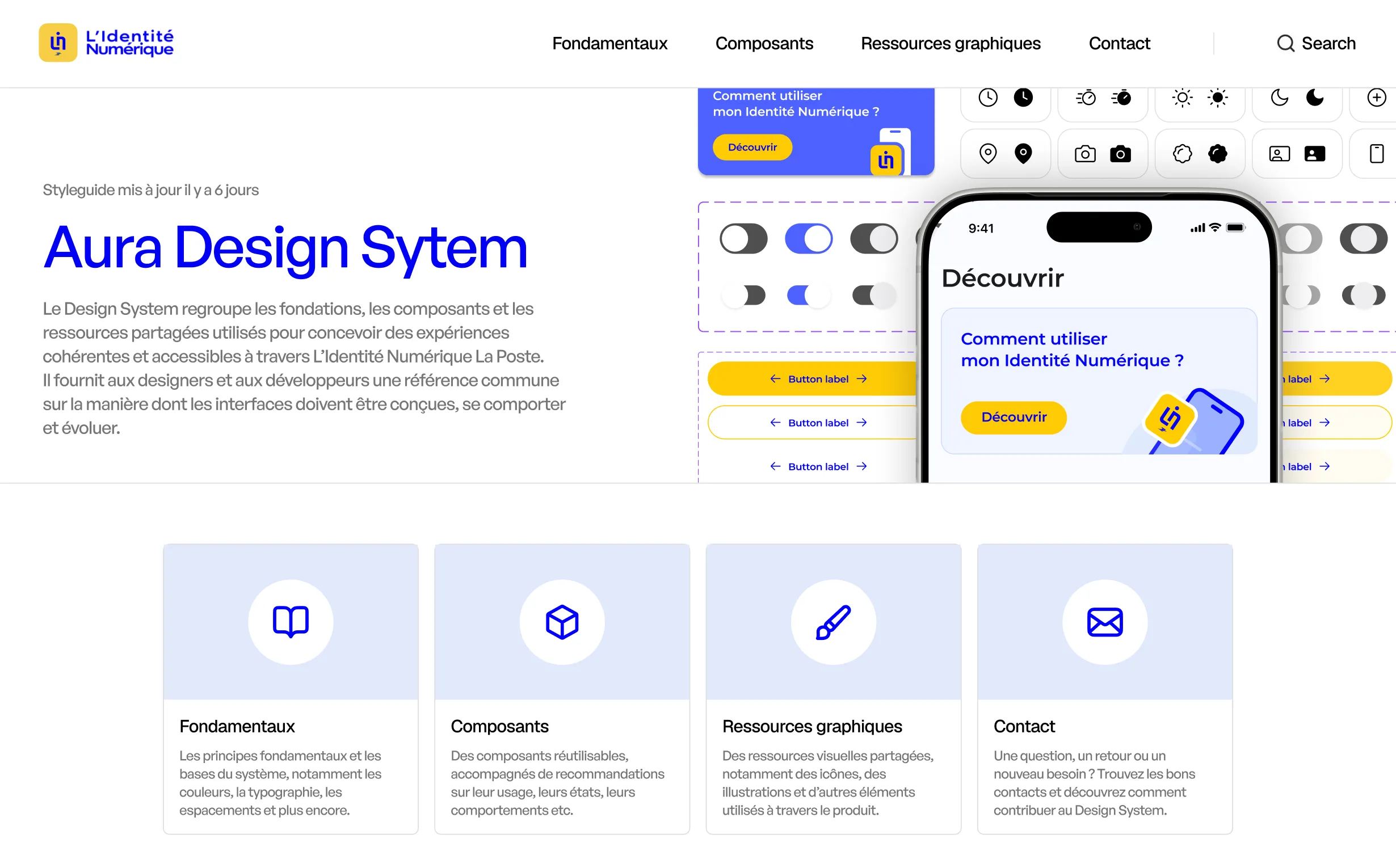
The layer behind the quality
04Implementation
Our responsibility did not end when the designs were approved.
Before each handoff, we prepared dedicated delivery files and reviewed the screens again to check component usage, consistency, states and the details needed for implementation.
Designs were then published in Zeplin, organised separately for iOS, Android and Web. During development, a dedicated UI/Dev channel allowed developers to come directly to us whenever a specification or behaviour needed clarification.
Once a feature had been implemented, I took part in Design and functional QA in a test environment. When the implementation differed from the intended experience, we documented the discrepancy, created tickets and worked with developers on the required corrections before release.
The same rules we had defined in the Design System therefore continued through design, handoff, implementation and QA. UI quality did not stop at Figma.
05Reflection
This project changed how I think about UI craft. On a product evolving across multiple squads, quality does not depend only on the precision of an individual interface. It also depends on the rules, components, conventions and processes that allow that precision to remain consistent over time.
When the same problem appears repeatedly, the most valuable answer is often not another local fix, but a shared solution that improves the system behind it.
That system-level mindset is something I have carried into my later Product Design work.